Product · New
Numbers tell you what happened. Explorer shows you why: six new interactive chart views that turn your Accounting data into something you can actually read at a glance, then click straight into.
Your financials, but visual
Every business ends up staring at the same wall of numbers: a P&L, a ledger, an aging schedule. They’re accurate, but they don’t tell a story on their own. Explorer is a new way to see your Accounting data: six chart types built specifically for the questions finance teams actually ask, each one interactive, each one one click away from the ledger entry behind it.
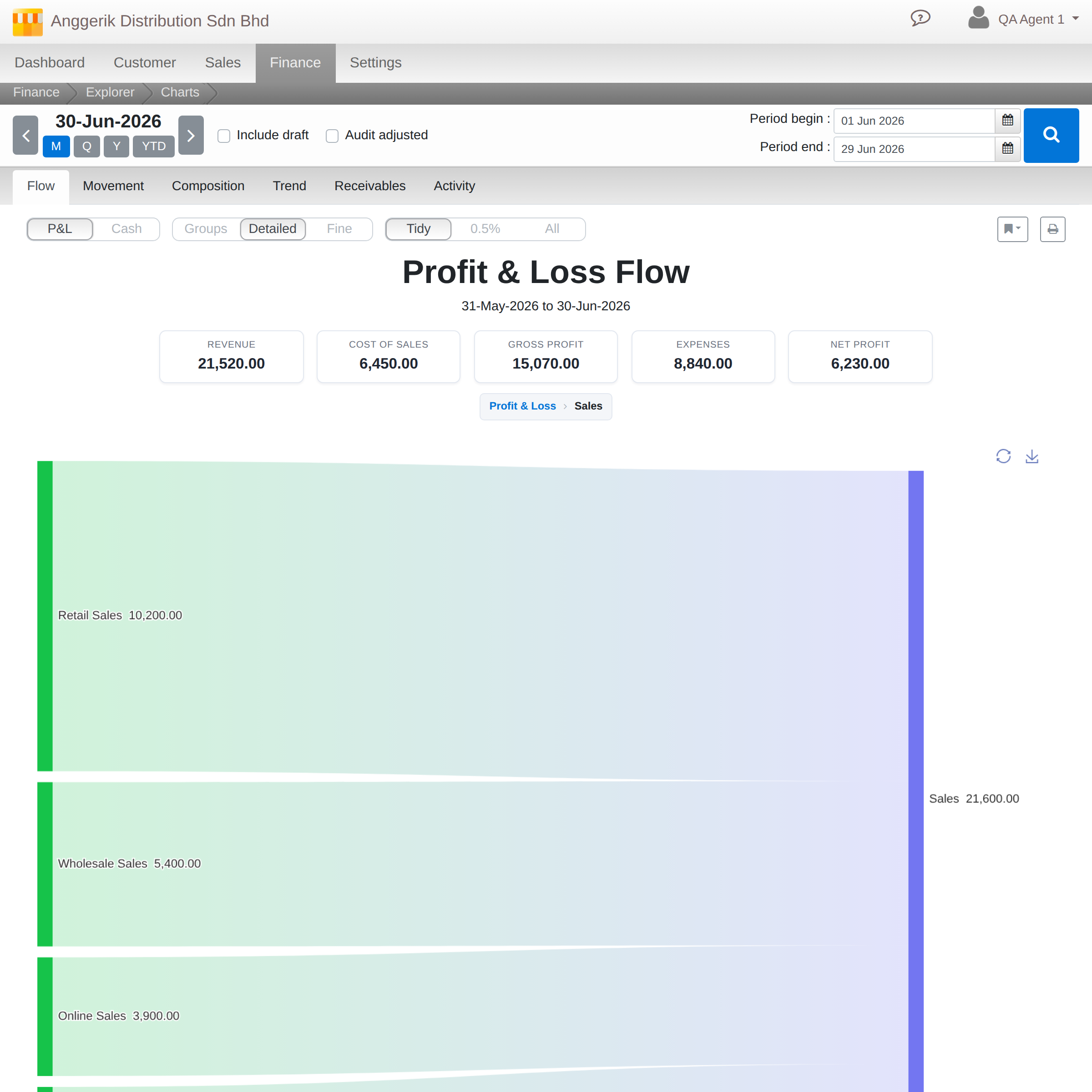
Flow: watch revenue become profit
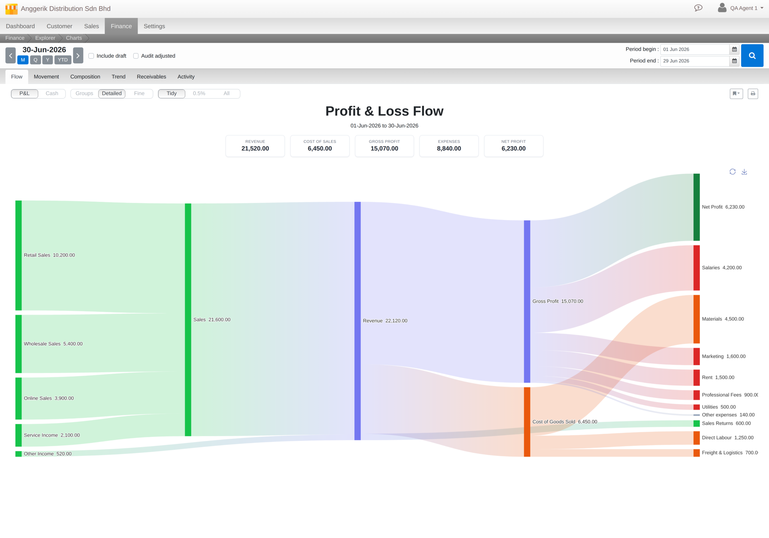
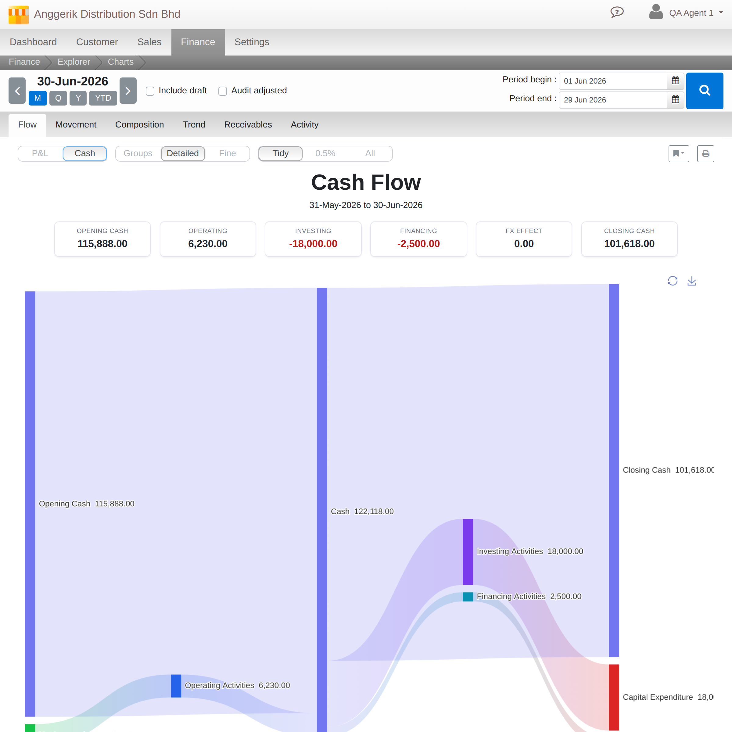
A Sankey diagram traces exactly how revenue moves through your business and comes out the other side as profit, or how cash flows in and out over a period. Every link is sized by magnitude, so the biggest costs and the biggest wins are visually obvious before you read a single number.
Movement: see exactly what changed
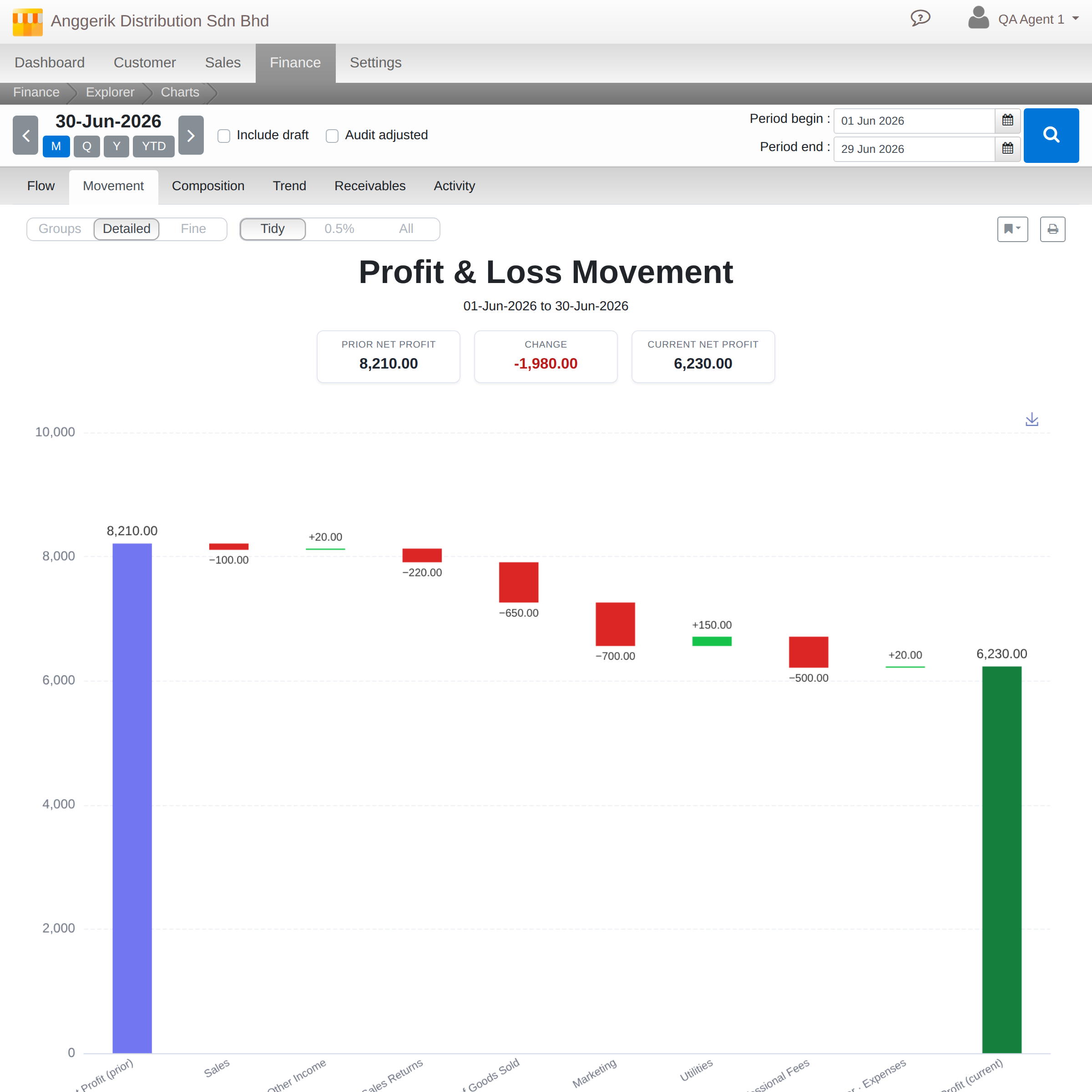
A waterfall view puts this period side by side with the last one, and shows precisely which lines moved the needle, up or down, and by how much. No more manually diffing two P&L exports.
Composition: size up your P&L at a glance
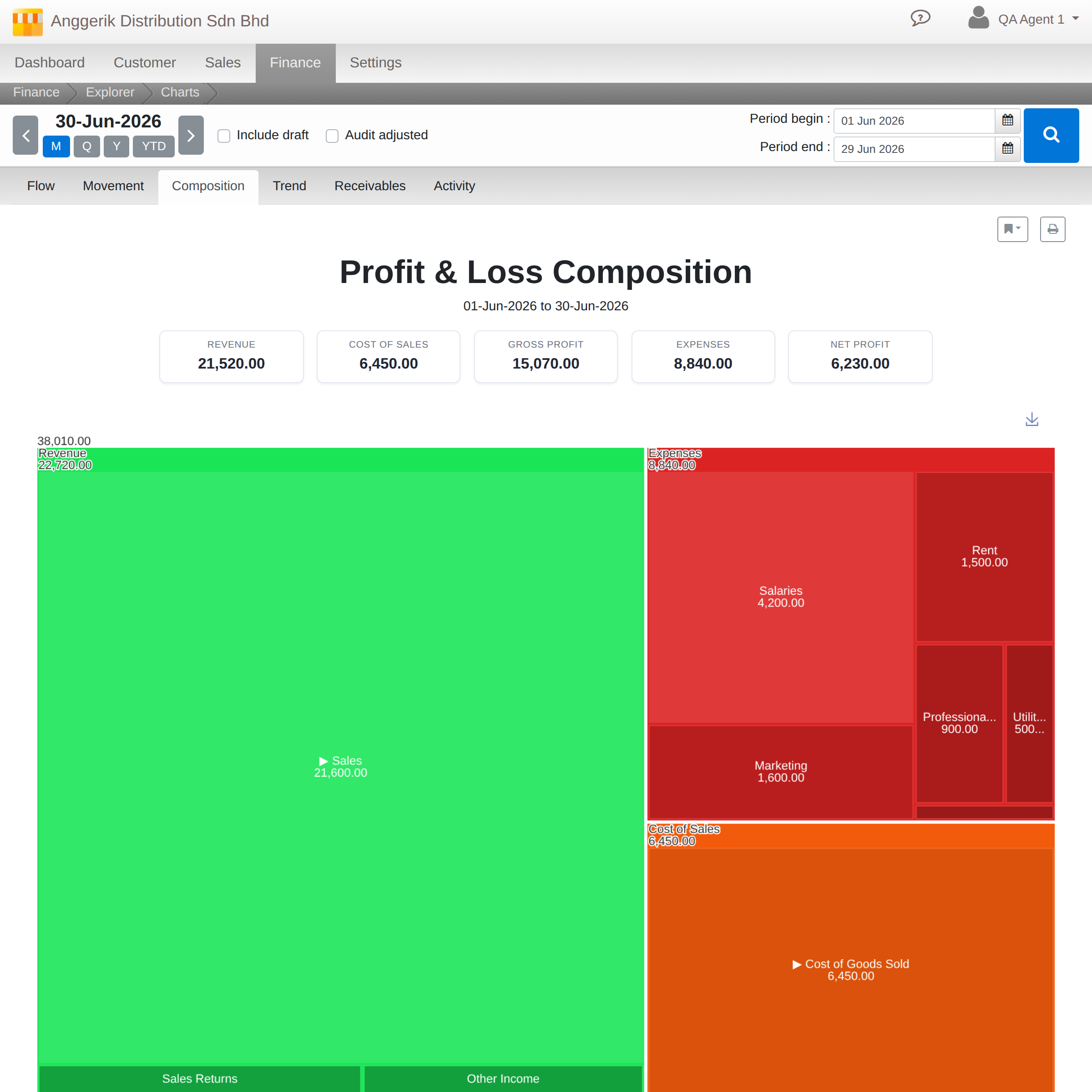
A zoomable treemap lays out revenue, cost of goods, and expenses as proportionally-sized blocks, so the shape of your business is visible in one screen. Zoom into any block to break it down further.
Trend: scroll through your history
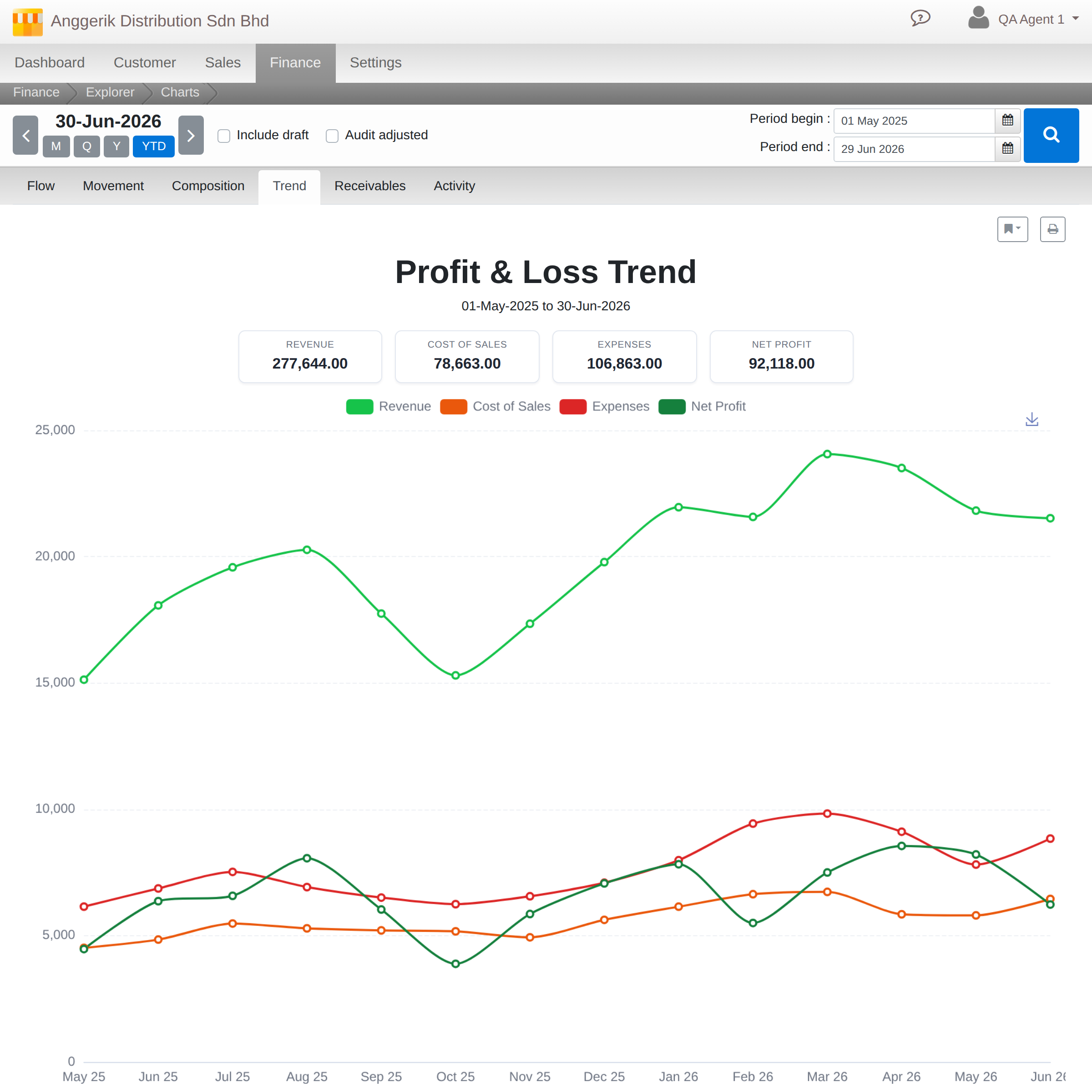
A multi-series line view plots your key P&L lines over time, with a scrollable, zoomable timeline so you can compress a year into one glance or zoom into a single rough quarter.
Receivables: know who owes you, and how concentrated the risk is
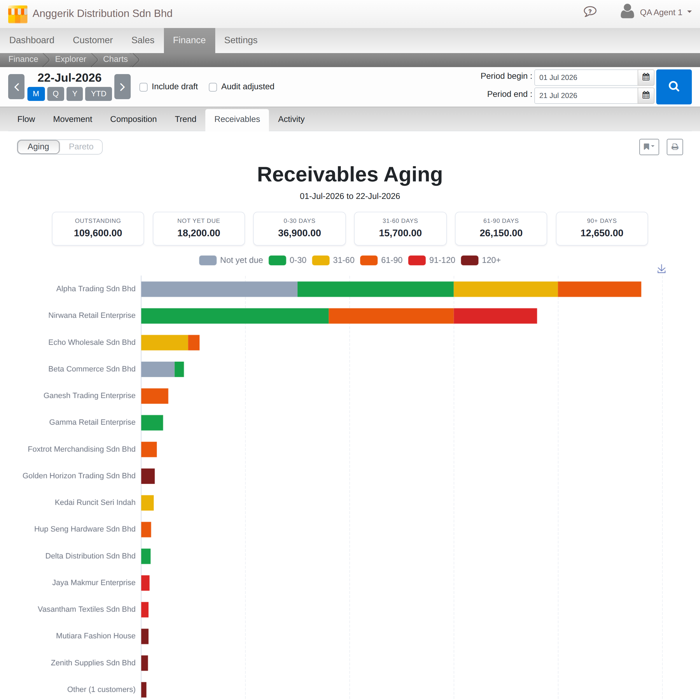
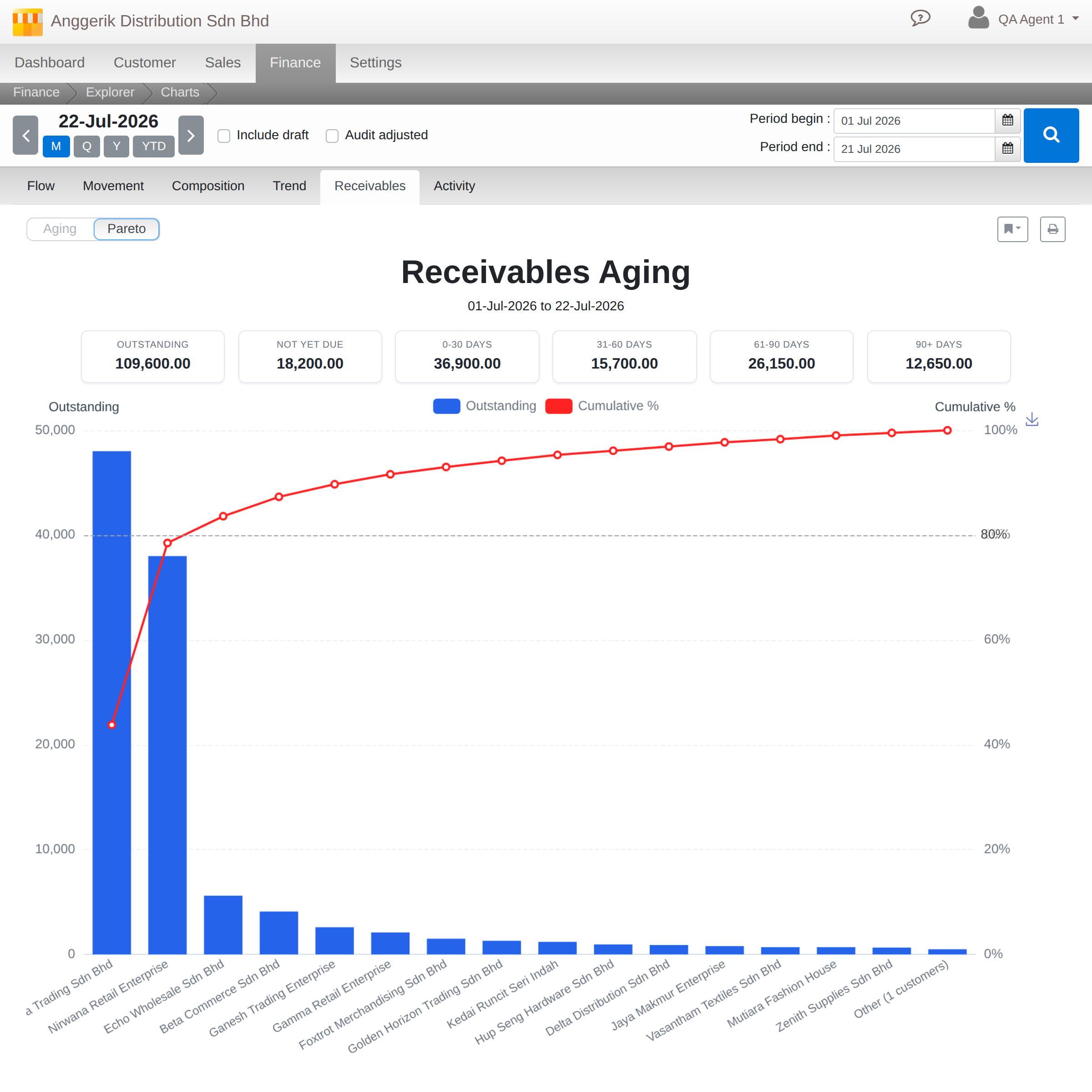
An aging view and an 80/20 Pareto view, side by side: see your receivables bucketed by how overdue they are, or see exactly how much of your outstanding balance sits with a handful of customers.
Activity: spot the rhythm of your cash
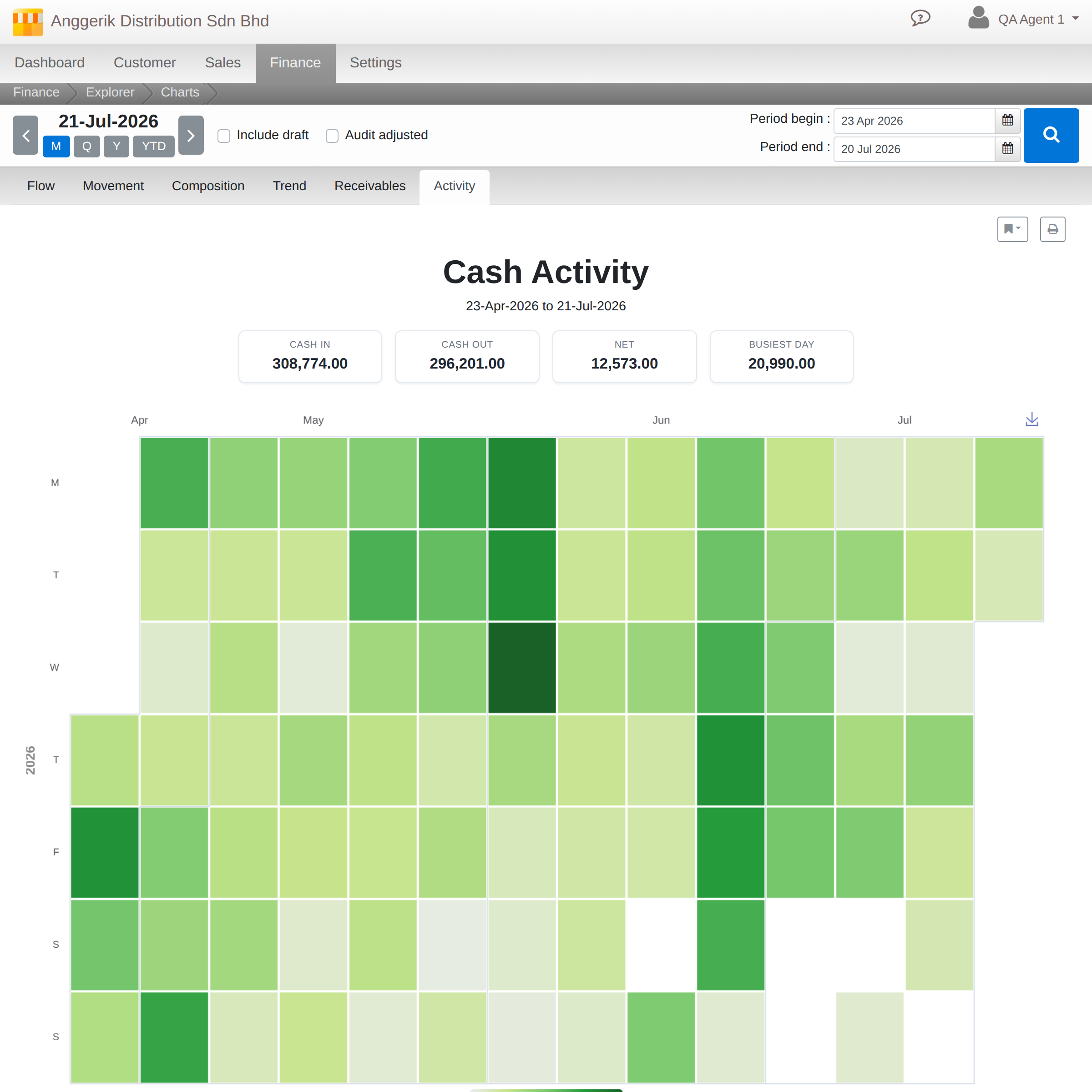
A calendar heatmap of daily cash in and out, so seasonal patterns, month-end spikes, and quiet stretches are visible at a glance, not buried in a transaction list.
Built to explore, not just to view
Every chart is a starting point, not an endpoint. Click into any node or bar to drill down a level, with a breadcrumb trail back out. Ctrl/Cmd-click jumps straight to the underlying ledger entry. Save a view once you’ve tuned the depth and filters just right, export any chart as an image, or print a full report page with the KPIs and chart together.

Available now
Explorer is live today under Accounting > Reports for every Cloudby workspace. No setup required: it reads from the same ledger data your reports already use.